iOS and Twitter OAuth Login

I have recently been working on a iOS (iPhone) application for a client. This app needed to have the ability to post things to Twitter and Facebook.

Facebook provides a really nice SDK which (with a few hacks) provides an inline login dialog which handles all the oAuth details for you. It looks good and works well.

Twitter unfortunately does not do the same and while there are hundreds of Twitter-iOS libraries out there, they are all overly complicated and provide a UI which is not consistent with how the Facebook SDK does things, which if i want my app to appear good and consistent then they must look and behave the same.

The other main reason was because the libraries were overly complicated, they used the “Out of band” oAuth authentication which means a user has to copy a pin from a web page into the application, which is hardly a nice thing to do. Yet Facebook doesn’t have to do this. After a bit of investigation i found out twitter didn’t have to either.

To solve all of this i have created a simple demo application and library, utilizing the Facebook-iOS-SDK and PlainOAuth (by Jaanus Kase) projects as a basis and building what i wanted on top.

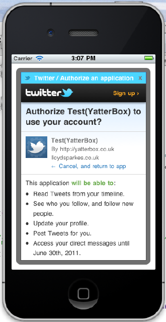
A lot of the code should be self explanatory. And below is a screen shot of what the end result is. You can find the project on git hub here: https://github.com/lloydsparkes/unoffical-twitter-sdk
MetroTwit

About a month ago i started using MetroTwit. Its a really good, nice, clean twitter application which runs brilliantly on Windows 7. I moved to it because of its great UI but in the most recent update they seem to have gone a bit AWOL on the UI. So the aim of this post is to point this out to them so they can improve in the next version.

MetroTwitApp

I have colour coded the issues.

Starting from the top, the green box. Why is the Timestamp / Client at the top, i think it looks weird put it to the bottom.

Next is the pink box. Now this is personal preference, i personally think its redundant information, maybe make it a configurable option.

Next is the light blue box, now it is good that they added support for retweet API, BUT i do not think they put any thought into the design of that “Retweeted by ….” component, i think it could be done more subtly  without taking up the large amount of space that it does.

Finally we get to the orange boxes, they need to have a bigger margin with the window border. I would suggest looking at evening out the spacing between all of the buttons so it appears equal.

Just to close off i would like to just say that it is a great piece of software, and is by far the best twitter client there is for windows so keep up the good work guys!

So im making a twitter client

Over the last few weeks i have been learning WPF, and have been creating a Twitter Client

While i am still learning, this is what i have produced so far, although now i have learnt more i am planning on a slight redesign

[edit: there was a picture here, but due to a server crash it disappeared (i now have better backups)]

What do you think?

I did have to stop using Visual Studio 2010 as its editor was playing up and begin really slow, although this is a beta, and i expect this to be corrected